What do all the Radar metrics mean?
Cadence records your radar data and shows both live metrics and extra details on your saved activities.
Live Metrics
While recording your ride Cadence will display a bar on the left or right side of your screen, showing cars detected, their live position, and their alert level (green = no cars, orange = car detected, red = high speed car detected).
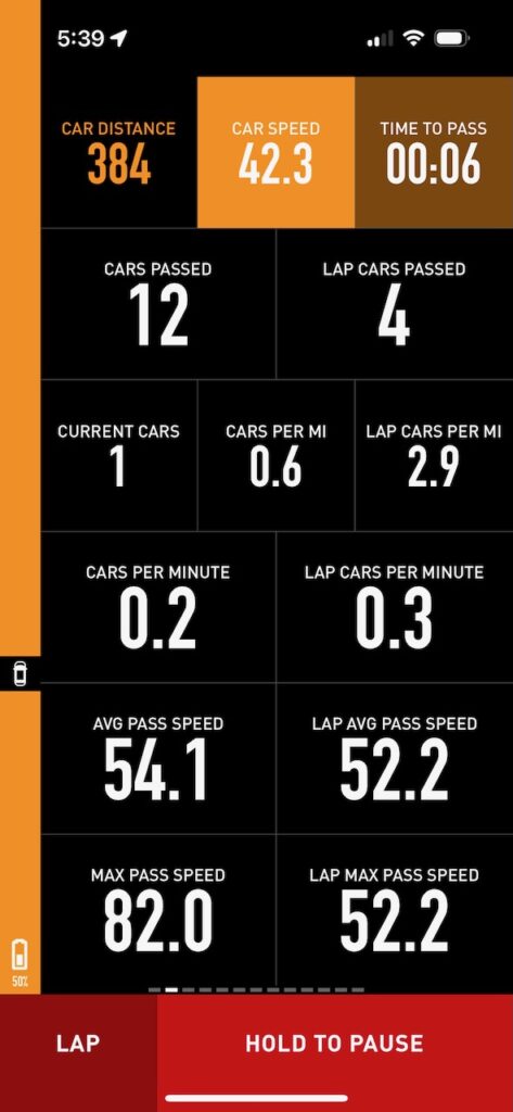
In addition to that, you can add the following radar metrics to any of your Computer screens:
- Nearest Car Distance
- Nearest Car Speed
- Nearest Car Time to Pass
- Current Cars Detected
- Cars per Mi/Km
- Lap Cars per Mi/Km
- Total Cars Passed
- Lap Total Cars Passed
- Cars per Minute
- Lap Cars per Minute
- Average Pass Speed
- Lap Average Pass Speed
- Max Pass Speed
- Lap Max Pass Speed

Map Display
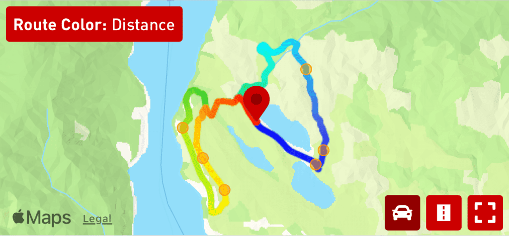
On the Cadence > History > Activity Details screen, you’ll see a car icon on the map. Tap that and you can view where cars passed you. Cars only count as passed if they were detected within 10 meters of the radar, which helps prevent counting cars that turned or otherwise disappeared. The colors of the dots represent the speed the cars passed (yellow for slow, red for fast):

Car Passing Information
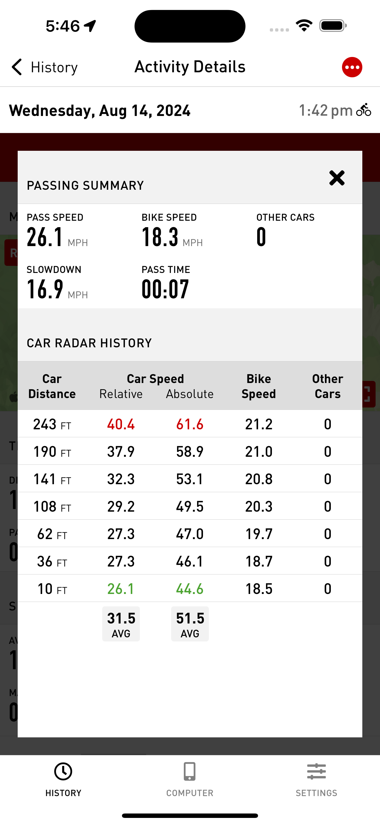
If you tap on one of the dots, you’ll see a Passing Summary and Car Radar History for that particular car.
In the Passing Summary, you’ll see how fast the car was moving relative to the bike when it passed (26.1 mph), how fast the bike was moving (18.3 mph), how many other cars were detected (0), how much the car slowed down from its maximum speed (16.9 mph), and how long the car took to pass after it was detected (7 seconds).
The Car Radar History table shows the statistics for each time the car was detected and recorded. For instance, when the car was 141 ft feet behind, it was traveling at a relative speed of 32.3mph (relative speed being the absolute speed of the car minus how fast the bike was moving) and absolute speed of 53.1 mph. The bike was moving at 20.8 mph and there were no other cars detected at the time. The speeds highlighted in red represented the highest, and green the lowest.

Radar Summary and Chart
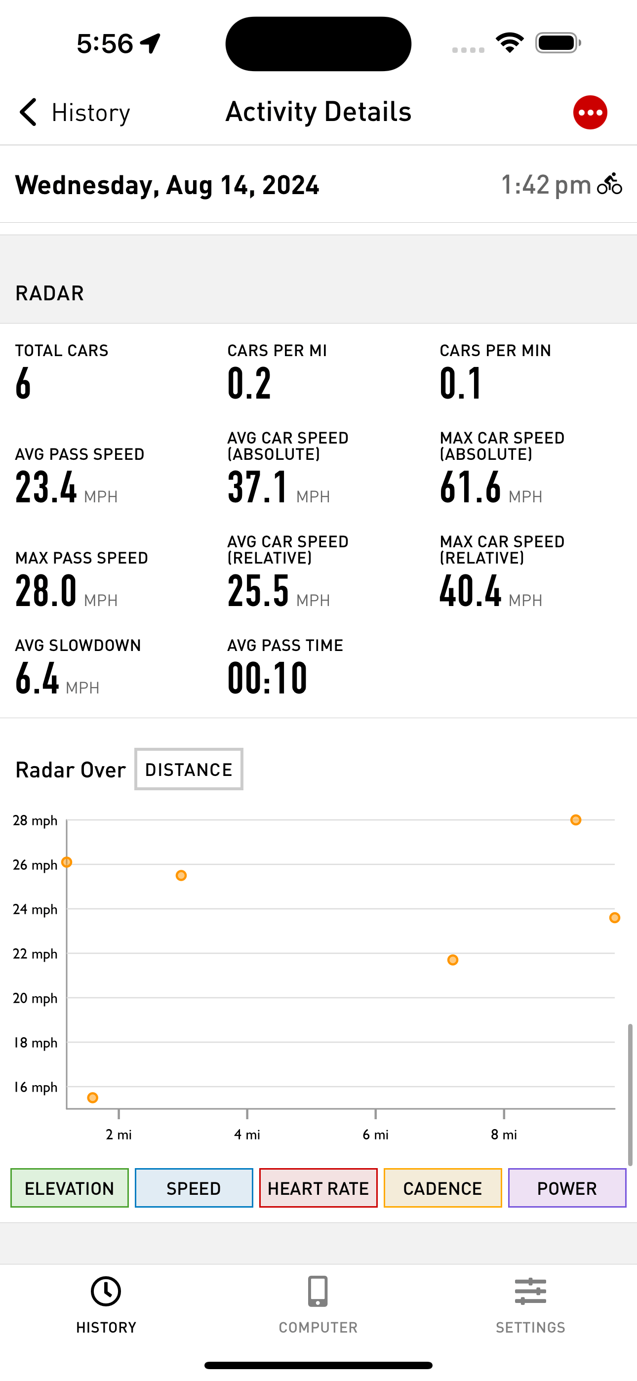
Towards the bottom of the Activity Details screen, you’ll see general radar stats including total cars detected, how many cars were detected per mi/km and minute, etc.
Below that is a chart showing where cars passed over distance or time. Again, the colors represent speed (yellow and red), and their size represents how many cars were detected at the time. In this example there was only ever one car detected at a time so all the dots are the same small size.


